
Linen & Heather shares practical, down-to-earth guidance on sustainable linen home textiles and natural interiors for readers across the UK.
- 0123456789
- Angle Bd Abdelmoumen & rue soumaya, Résidence
- [email protected]
Linen & Heather shares practical, down-to-earth guidance on sustainable linen home textiles and natural interiors for readers across the UK.
 By James Merrick
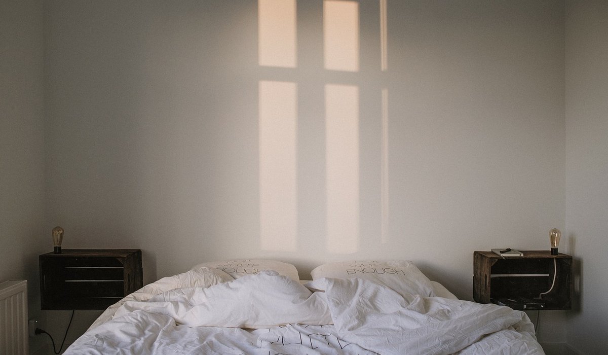
A north-facing room receives no direct sunlight. What it gets instead is a cool, blue-leaning light that stays remarkably consistent through the day, shifting only slightly towards grey on overcast afternoons. That consistency is a gift for some colours and a curse for others. Whites that looked creamy in a south-facing hallway will read chilly and faintly blue against a north wall, while strong yellows and oranges often turn muddled rather than sunny. Before you order anything, spend a day noticing how the room behaves: where the light falls at 9am, where shadows pool at 4pm, and how the walls look once the lamps go on. Then test any linen sample in the room itself, at three times of day, against the wall it will actually sit near. A swatch judged under a shop's warm lighting tells you almost nothing.
Linen has an advantage that smoother fabrics lack: texture. The visible weave, the slubs and the slight irregularity of the yarn break up flat, even light and give it something to catch on. A stonewashed linen absorbs dye unevenly, so a single colour reads as several subtle tones across a cushion or a duvet cover — depth that a plain cotton or polyester cannot manage in a north-facing room. Finish matters too. A gentle washed sheen reflects a little light back into the room, while a very matte, heavy linen will swallow it. As a rough guide, bedding in the 165–200gsm range drapes softly and lifts a room; curtains benefit from something heavier, around 240–260gsm, so they hang properly and filter the grey rather than amplifying it. Mixing weights is one of the simplest ways to add interest without adding colour.
If you want a north-facing room to feel lighter without turning it into a pastel box, warm neutrals do most of the work. Think oatmeal, barley, fawn, wheat, ecru and biscuit rather than brilliant white or cool grey. The rule is simple: look for a neutral with a yellow, honey or soft green undertone, not a pink or blue one. Undyed and natural linen is often ideal here, because the flax fibre itself carries a faint warm cast that flatters cool light.
A quick test: hold the fabric against a sheet of plain white paper in the room. If it suddenly looks pinkish or grey, leave it. If it looks like warm cream, it will work.
Green is the natural ally of a cool, north-facing space. Because green sits opposite blue on the colour wheel, it quietly neutralises that chilly cast without shouting. Sage, eucalyptus, lichen and pale willow are the safest choices, and they look particularly good in linen because the fabric's texture stops them feeling flat or clinical.
Do be cautious with acid or lime greens. In northern light they can turn sharp and slightly sickly, particularly across a large surface. Keep them to a piped edge or a single small accessory, if you use them at all.
Heather is the most underrated colour family for darker rooms. A muted lilac, dusty mauve or soft damson brings softness and a little romance, and it flatters natural wood and aged brass. The trick is in the undertone: purple is made from blue and red, and north light exaggerates the blue. Choose heathers that lean towards red or brown — think dried lavender, plum skin, faded damson — and avoid anything icy or silvery. Use them as accents rather than full schemes: a heather throw draped over oatmeal bedding, a pair of heather cushions on a sage sofa, a mauve tablecloth in a dining room that only ever sees grey light. This keeps the room from tipping into cold melancholy while still giving it character.
Once your palette is chosen, the way you layer it matters as much as the colours themselves. Keep your biggest surfaces light and warm, then build depth with mid-tones and a few darker accents.
Practical care helps too. Linen softens and lightens slightly with every wash, so a colour that feels a shade too deep on arrival will settle. Wash at 30°C, skip optical brighteners, and line dry in the shade where you can. Finally, order swatches before committing — three or four in the tones above, viewed in your own room at different hours. It is the cheapest way to be sure, and the most reliable.


We are not gonna make spamming
